
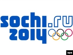
It's only 1,528 days to the Sochi Winter Olympics and they've just launched their new logo and brand.
I like it: it looks clean, forward-looking, transparent -- everything that perhaps Russia should be, but isn't. But hey, that's branding.
Another editor here disagreed, nostalgic for Misha, the bear mascot from the 1980 Moscow Olympics.
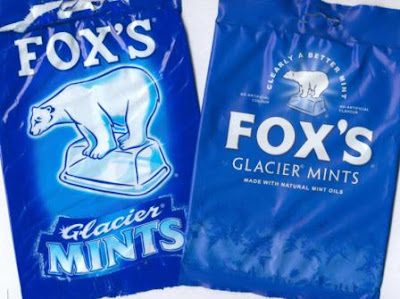
 The fonts, styling, and color scheme of the Sochi logo also seem strangely reminiscent of United Russia's logo, which also for some reason reminds me of a Fox's Glacier Mint.
The cartoon above is from Mikhail Zlatkovsky, a cartoonist from our Russian Service. Click to see it in all its glory.
So readers, any thoughts on the Sochi logo? Love it, hate it?
-- Luke Allnutt
I like it: it looks clean, forward-looking, transparent -- everything that perhaps Russia should be, but isn't. But hey, that's branding.
Another editor here disagreed, nostalgic for Misha, the bear mascot from the 1980 Moscow Olympics.

The cartoon above is from Mikhail Zlatkovsky, a cartoonist from our Russian Service. Click to see it in all its glory.
So readers, any thoughts on the Sochi logo? Love it, hate it?
-- Luke Allnutt